
Submarket
Selection
The Art and the Science
I’ve always been fascinated by where people choose to live and why. What makes one area sought after and others avoided? The beauty of this question is that it’s both qualitative and quantitative; there’s art and science. The qualitative side is that a neighborhood needs the right feel, a natural vibrancy that connects with people and makes them excited to live there, while also being practical, with access to jobs and services. I love the art side of the question, but this exercise is about the science. Using geospatial data from the US Census1, we can look at San Francisco as a case study to see which neighborhoods are poised for growth and help identify submarkets that have opportunities for investment in multifamily properties as a result.
Median Income
Median income, and specifically median income growth within a neighborhood is what we’re looking to triangulate, which means it’s probably a good idea to start out by looking at how median income is currently distributed in San Francisco. Below are two maps. The first is median income of San Francisco in 2015. The second is median income in 2019.
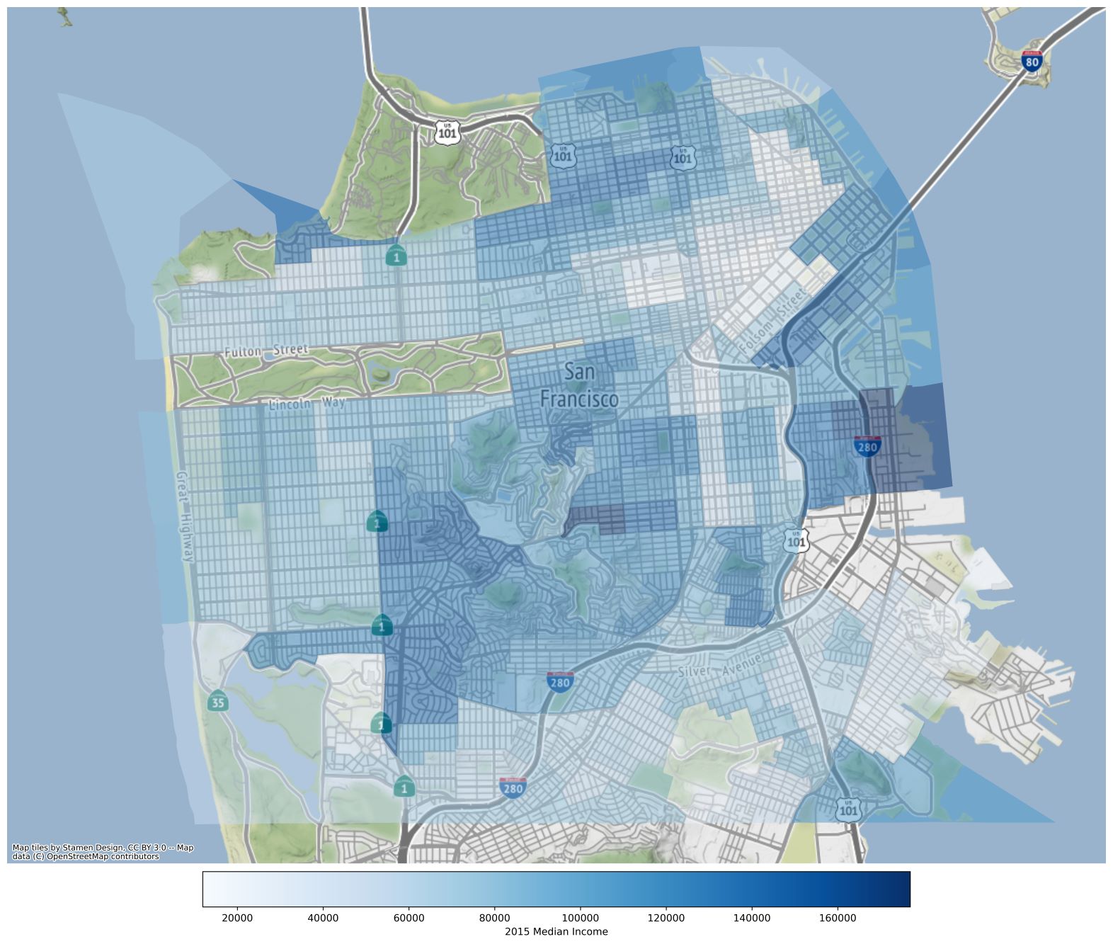
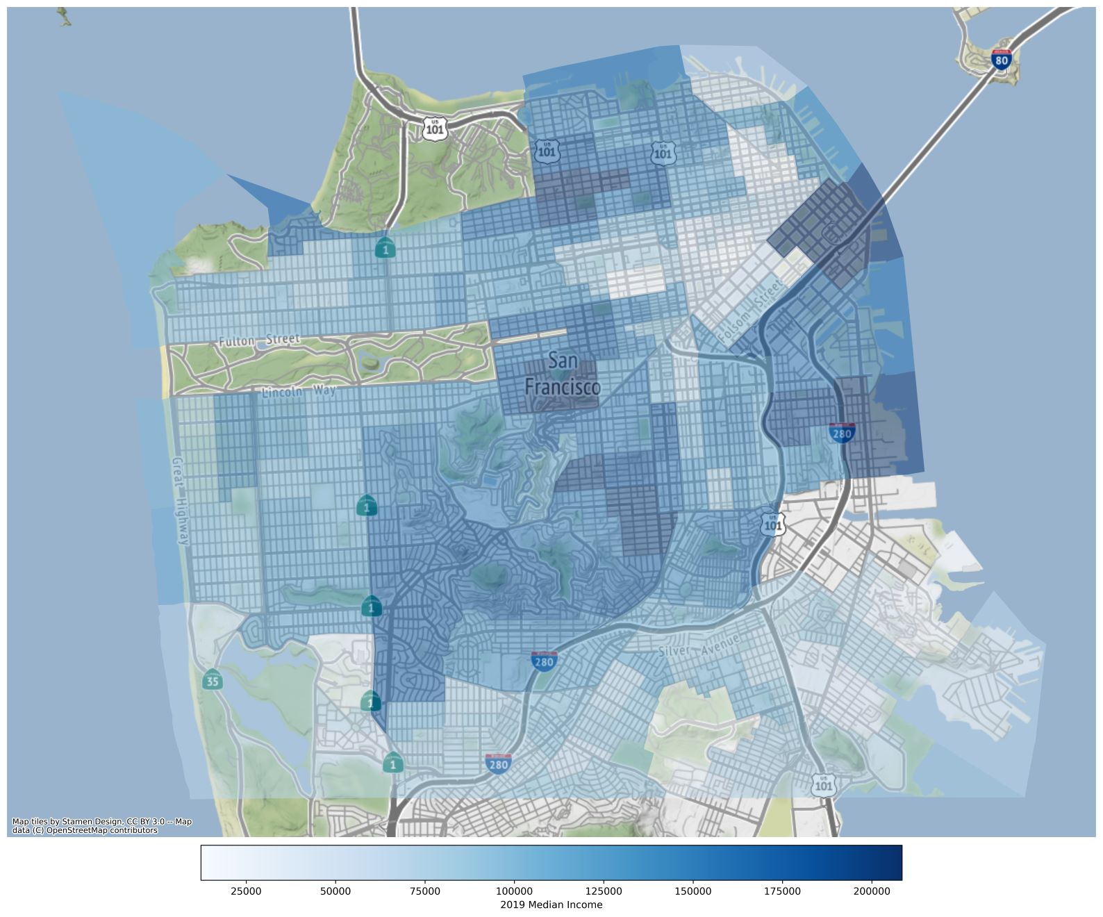
San Francisco has three distinct pockets of high median income, which we’ll call the Ring, the Estates and the Highrises. The Ring is first pocket that I look for when I examine a map of median income. Commonly, the most desirable locations are within a certain range of distances from downtown. The range varies depending on the size, density and transit efficiency of a city. Since San Francisco is compact, its Ring is at a range of 2-3 miles from downtown. This area includes some of the city’s wealthiest areas, such as Pac Heights, the Marina and Noe Valley. Outside of the Ring, San Francisco has concentrations of high median income in neighborhoods that have a high percentage of large lots and single-family homes. This is again very typical for US cities. What these neighborhoods lack in proximity to downtown, they make up for in stately homes. These neighborhoods are the Estates. The newest addition to the cadre of high-income areas is the Highrises. On the opposite end of the spectrum from the Estates, if you’re fine with less space and absolutely hate commuting, why not live in downtown? Or better yet, live above downtown. The exact location and form of these pockets changes from city to city but they exist in pretty much all large US cities, and in San Francisco they’re very well defined.
San Francisco has three distinct pockets of high median income, which we’ll call the Ring, the Estates and the Highrises.
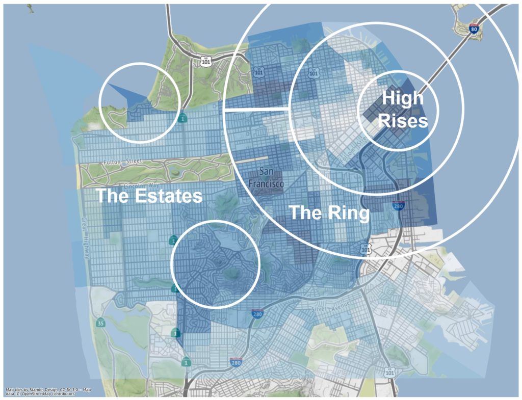
In the case of San Francisco, the Ring is the most important grouping when it comes to identifying areas that will improve in the future and ultimately for finding investment opportunities. These areas have a distinct location advantage, and there are areas in the Ring that aren’t already unaffordable. Unlike the Ring, the Estate neighborhoods aren’t replicable in a place like San Francisco because no other neighborhoods have large, single-family homes. Highrise neighborhoods have a location advantage but investing in these neighborhoods is – like the buildings themselves – rarified air. Building or buying a high-rise apartment building costs tens or even hundreds of millions of dollars. Most actionable opportunities are going to be in the Ring.
… the Ring is the most important grouping when it comes to identifying areas that will improve in the future…
The Spillover Effect
As a city grows in population or a median income rises, high-median income areas tend to expand while low-median income areas contract. This causes a spillover effect in which low-income areas near high-income areas experience faster growth than other low-income areas2. While this fact is rather intuitive, the advantage of using geospatial data is that we can isolate exactly which areas meet these criteria. Below is a map that contains census tracts which are in the bottom half of 2019 median income and abut a census tract in the top quartile of 2019 median income.
… spillover effect in which low-income areas near high-income areas experience faster growth…
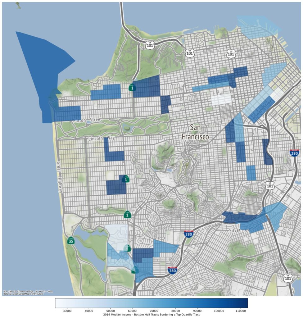
Unsurprisingly, areas that fit these criteria are the ones next to the Ring, Estates and Highrise neighborhoods. Once again, intuition says that we should discount the areas next to the Estates because the alure of Estates is their large, luxury homes, which don’t exist in surrounding neighborhoods. And the neighborhoods around the Highrises are difficult to invest in without doing large-scale development. Thankfully, there are areas where the Ring is expanding or filling in.
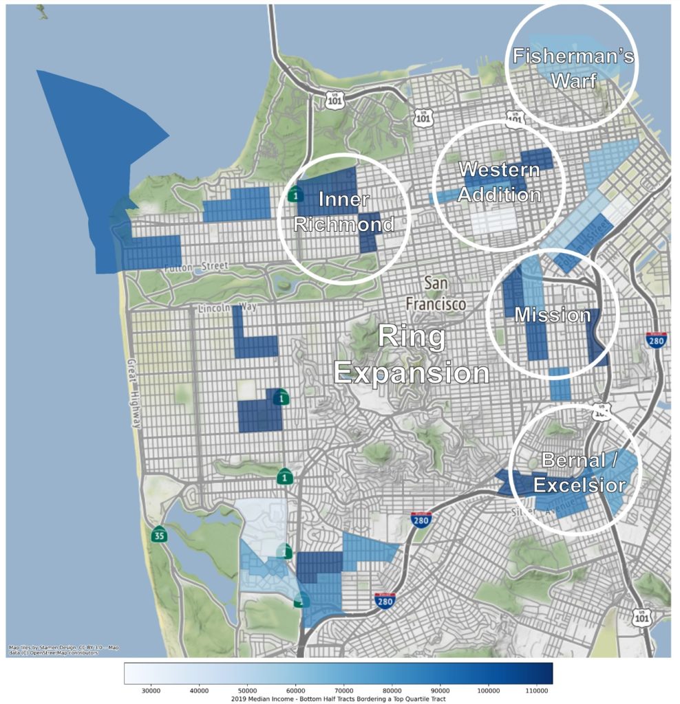
As an eye test, Inner Richmond, Western Addition, the Mission, and Bernal / Excelsior all look like areas that could grow significantly. Fisherman’s Warf would probably be a very nice place to live if it weren’t a tourist hotspot.
Education
Educational attainment rates, as defined as the portion of the population older than 25 with a bachelor’s degree or higher, are a critical demand driver for cities, but at a neighborhood scale, education also plays a key role. Typically, highly educated areas also have high incomes. And more importantly, an upward shift in educational attainment can precede median income growth3. Early adopters of an improving neighborhood are often educated but low or middle income, while the second wave of people moving in are educated with higher incomes. Below is the educational attainment distribution of San Francisco in 2015 and 2019.
… an upward shift in educational attainment can precede median income growth.
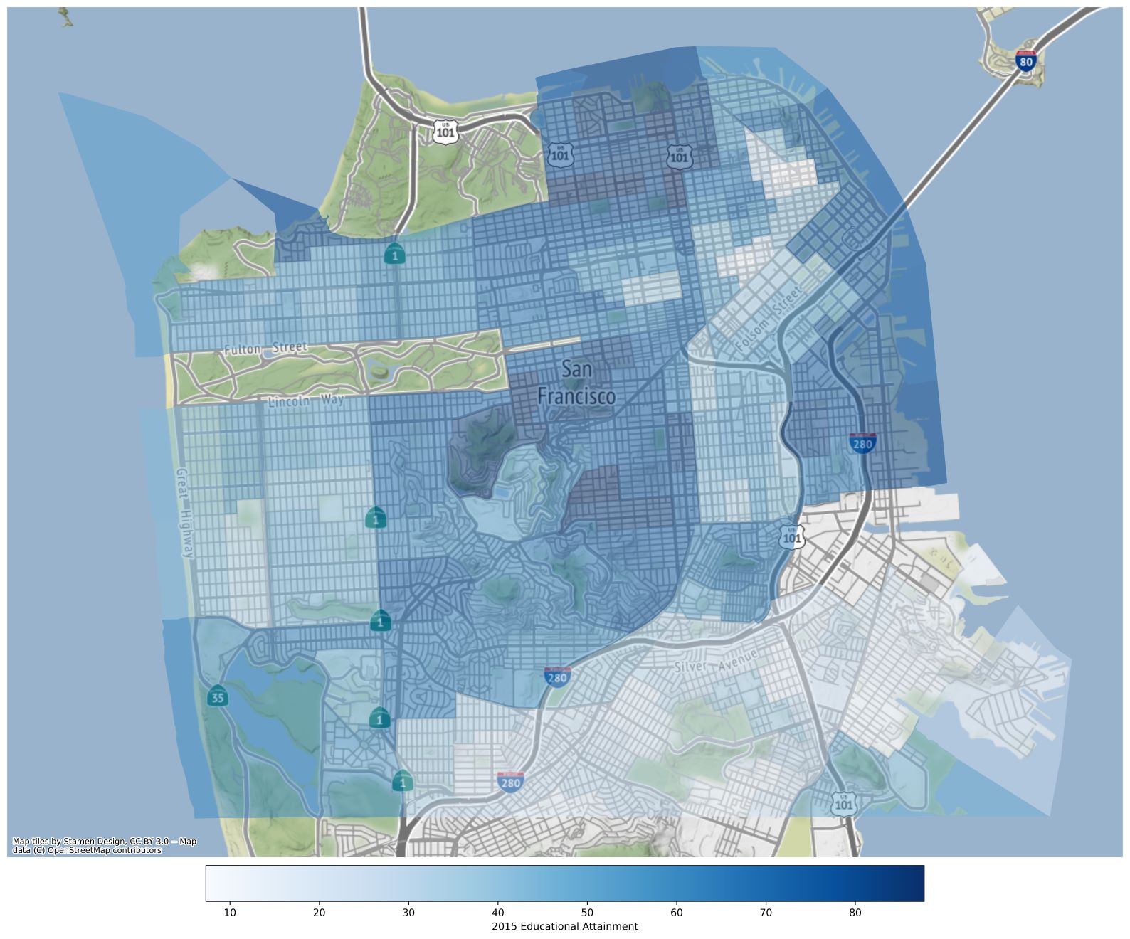
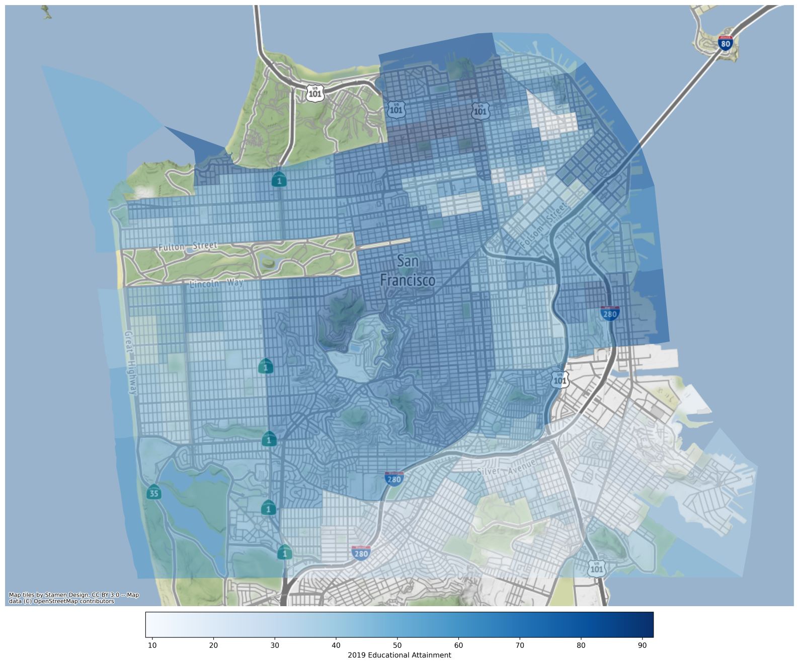
Notice that education distributions largely mirror the median income maps from above, and overall educational attainment is trending upward in San Francisco. Again, we can use geospatial tools to isolate which areas had the highest educational attainment growth, by only selecting tracts where the growth rate was at least one standard deviation above the mean.
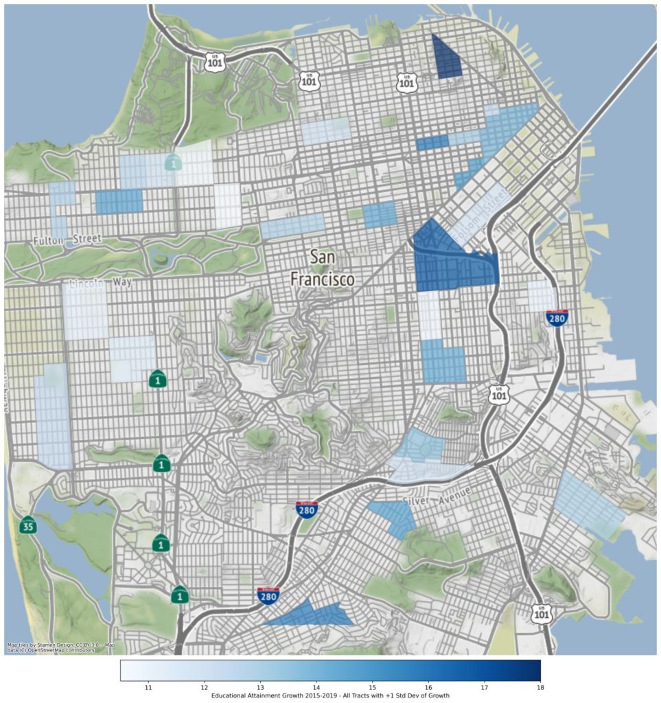
Between this map and the map of potential “spillover” neighborhoods, there’s significant overlap, which affirms that this spillover has already started to take place.
Again, Inner Richmond, Western Addition, the Mission, and Bernal / Excelsior all show up in this data selection as areas that may be poised for a significant median income increase. If I were ever going to buy investment properties in San Francisco (unlikely, for reasons that are outside the scope of this exercise), these are the neighborhoods I would start with. Their location relative to downtown, proximity to high-median income neighborhoods and recent gains in education rate, all suggest that these are increasingly attractive places to live in San Francisco.
Again, Inner Richmond, Western Addition, the Mission, and Bernal / Excelsior all show up in this data selection…
The Next Steps
The next step in this analysis would be to start vetting the value of each of these neighborhoods from an investment standpoint, by tracking rental trends compared to recent property sales. However, neither of these data sets are publicly available, and in the case of the rental data, Cloudline relies on its own proprietary database. I believe in being an open book when it comes to how Clouldline forms an investment thesis, but there is such a thing as over sharing.
- US Census American Community Survey 5-Year Data
- Veronica Guerrieri, Daniel Hartley, Erik Hurst. Endogenous gentrification and housing price dynamics, Journal of Public Economics, Volume 100, 2013, Pages 45-60, ISSN 0047-2727, https://doi.org/10.1016/j.jpubeco.2013.02.001. (https://www.sciencedirect.com/science/article/pii/S0047272713000297)
- Walks, R. Alan; Maaranen, Richard, The Timing, Patterning, & Forms of Gentrification & Neighbourhood Upgrading in Montreal, Toronto, & Vancouver, 1961 to 2001, Cities Centre, University of Toronto, Research Paper 211
More Insights
A look at Cloudline’s market selection process. What are the demand drivers we should be focusing on and how do they compar across major markets?
posted 2/18/2022
Supply is often just as important as demand, and even a great market can still be overpriced.
posted 2/18/2022
All about how syndications work, from start to finish.
